分类: 嵌入式
2012-07-11 14:58:25
![]() Using the FluidMove Behavior - Page 1
Using the FluidMove Behavior - Page 1
by kirupa | 18 November 2009
There are a handful behaviors we ship with Expression Blend 3. One fun one is the FluidMove behavior, but how exactly it works may not be entirely obvious. In this article, I will show you how to do some cool things using this behavior that may even make some of your everyday applications spring to life with very little effort.
As always, let's first look at an example. Below is a series of rectangles stuck inside a WrapPanel which lives inside a ScrollViewer. The + and - buttons below adjust the width of the ScrollViewer:
[ press and hold the + and - buttons to see some rearranging ]
Press and hold the - button and release after a few seconds to see what happens as the ScrollViewer's width is made smaller. Because of the way layout works inside the WrapPanel, notice that columns of rectangles wrap and move to a new position based on how much space they now have (or don't have!).
What is interesting is how the rectangles readjust. It isn't a direct reposition like you would expect. Instead, the rectangles animate and ease in to their newfound positions:
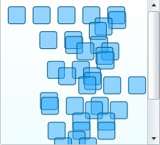
[ they are....animating! ]
You get the repositioning for free with the . That's what WrapPanels do - wrap the content when space becomes tight. The smooth transition you see as the rectangles are moved around is something you get thanks to the FluidMove behavior.
What is the FluidMove Behavior
The FluidMove behavior animates changes caused by layout such as resizing a window or removing some items from a StackPanel. Layout changes by default are sudden with no feedback or life. Any content that is the victim of a layout change simply appears in its new location.
The FluidMove behavior intercepts the layout changes so that the content has the ability to gracefully find its way to its new location. You saw an example of this above where resizing the scrollviewer had the effect of changing how much space the rectangles had to lay themselves out. As the rectangles were rearranged, they coolly eased in to their new positions.
In the next section, you will create a small application that highlights some of the FluidMove behavior's capabilities.
Getting Started
Let's start by creating a simple example where we re-create a variation of the application you saw above. The following steps will basically show you how to set up your application with some content placed inside a wrappanel, and this WrapPanel is contained inside a ScrollViewer.
As you resize your applicaton, the contents of your WrapPanel rearrange themselves. If you already know how to do all of that, just go ahead and jump over to the where you will actually add the FluidMove behavior. Otherwise, read on for the detailed step-by-step instructions:
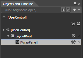
[ insert a WrapPanel into your LayoutRoot container ]
If you are in a Silverlight project and cannot find the WrapPanel by searching your Asset Library, then you are probably missing the Silverlight Toolkit. Please install it by and restart Blend. You will find the WrapPanel appear in the Asset Library after you launch Blend again.
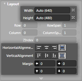
[ your WrapPanel's sizing should be Auto and Stretch ]
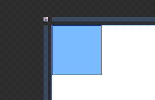
[ draw a single, lonely rectangle ]
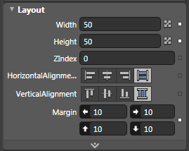
[ your rectangle will now become a square with a margin of 10 on all sides ]
The top-left corner of you artboard now look as follows:
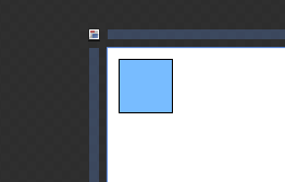
[ one...is the loneliest number () ]
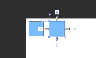
[ lonely no more ]
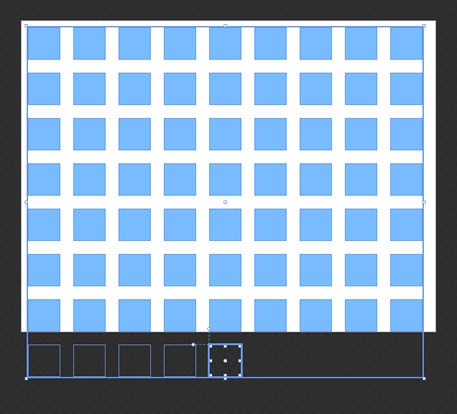
[ it is a block party - zing! ]
Ok, now we are at a good point where you have your application in a semi-finished state for what we will need. Let's move on to the where we will get this app closer to being finished.
Onwards to the !