分类: Python/Ruby
2012-11-02 14:03:29
A Entry presents the user with a single line text field that they can use to type in a value. These can be just about anything: their name, a city, a password, social security number, and so on.
Syntax:Here is a simple syntax to create this widget:
| TkEntry.new{ .....Standard Options.... .....Widget-specific Options.... } |
These options have been described in previous chapter.
Widget-specific Options:| SN | Options with Description |
|---|---|
| 1 | disabledbackground => String Specifies the background color to use when the entry is disabled. If this option is the empty string, the normal background color is used. |
| 2 | disabledforeground => String Specifies the foreground color to use when the entry is disabled. If this option is the empty string, the normal foreground color is used. |
| 3 | readonlybackground => String Specifies the background color to use when the entry is read-only. If this option is the empty string, the normal background color is used. |
| 4 | show => String If this option is specified, then the true contents of the entry are not displayed in the window. Instead, each character in the entry's value will be displayed as the first character in the value of this option, such as ``*''. This is useful, for example, if the entry is to be used to enter a password. If characters in the entry are selected and copied elsewhere, the information copied will be what is displayed, not the true contents of the entry. |
| 5 | state => String Specifies one of three states for the entry: normal, disabled, or readonly. If the entry is readonly, then the value may not be changed using widget commands and no insertion cursor will be displayed, even if the input focus is in the widget; the contents of the widget may still be selected. If the entry is disabled, the value may not be changed, no insertion cursor will be displayed, the contents will not be selectable, and the entry may be displayed in a different color. |
| 6 | validate => String Specifies the mode in which validation should operate: none, focus, focusin, focusout, key, or all. It defaults to none. When you want validation, you must explicitly state which mode you wish to use. |
| 7 | validatecommand => String Specifies a script to eval when you want to validate the input into the entry widget. |
| 8 | width => Integer Specifies an integer value indicating the desired width of the entry window, in average-size characters of the widget's font. If the value is less than or equal to zero, the widget picks a size just large enough to hold its current text. |
We can validate entered value by setting the validatecommand option to a callback which will be evaluated according to the validate option as follows:
none: Default. This means no validation will occur.
focus: validatecommand will be called when the entry receives or loses focus.
focusin: validatecommand will be called when the entry receives focus.
focusout: validatecommand will be called when the entry loses focus.
key: validatecommand will be called when the entry is edited.
all: validatecommand will be called for all above conditions.
There are following useful methods to manipulate the content of an entry:
delete(first, ?last?): Delete one or more elements of the entry. First is the index of the first character to delete, and last is the index of the character just after the last one to delete. If last isn't specified it defaults to first+1, i.e. a single character is deleted. This command returns an empty string.
get: Returns the entry's string.
icursor(index): Arrange for the insertion cursor to be displayed just before the character given by index. Returns an empty string.
index(index): Returns the numerical index corresponding to index.
insert(index, string): Insert the characters of string just before the character indicated by index. Returns an empty string.
xview(args): This command is used to query and change the horizontal position of the text in the widget's window.
Ruby/Tk automatically creates class bindings for entries that give them the following default behavior. :
If the entry is disabled using the state option, then the entry's view can still be adjusted and text in the entry can still be selected, but no insertion cursor will be displayed and no text modifications will take place.
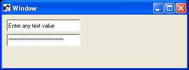
Examples:| require 'tk' root = TkRoot.new root.title = "Window" entry1 = TkEntry.new(root) entry2 = TkEntry.new(root) do show '*' end variable1 = TkVariable.new variable2 = TkVariable.new entry1.textvariable = variable1 entry2.textvariable = variable2 variable1.value = "Enter any text value" variable2.value = "Enter any confidential value" entry1.place('height' => 25, 'width' => 150, 'x' => 10, 'y' => 10) entry2.place('height' => 25, 'width' => 150, 'x' => 10, 'y' => 40) Tk.mainloop |
This will produce following result
