分类: 系统运维
2011-07-15 16:44:16
By
Date: Mar 3, 2006
If you're familiar with Web design concepts, you already know the basics of using Cascading Style Sheets (CSS). CSS sprites allow you to create a single file that contains all the images laid out in a grid, requiring only a single image and only a single server call. Jason Cranford Teague shows you how to tame your Web site graphics using CSS sprites to consolidate images into a single file.The idea (and the last part of the name) for CSS sprites originates in the early days of video games, when memory and speed were at a premium. To overcome system limitations, video game producers would lay out the thousands of small graphics used to create a game into a grid and then display each "sprite" as needed, masking out all but the needed part of the larger image.
Using CSS sprites takes a little lateral thinking. Generally, we think about building a Web page similar to building with Legos: one block at a time. Sure, you can reuse the same image "block" several times throughout the same page (relying on that nifty caching feature to speed render time), but at the end of the load, each image is an island unto itself. There are several drawbacks, not the least of which is that every little image used in your interface, no matter how small, represents a server call that can slow down your Web page’s overall rendering.
CSS sprites allow you to create a single file that contains all the images laid out in a grid, meaning only a single image and only a single server call, with roughly the same file size because the empty space is compressed. In that file, you will place all individual "sprites" that make up your interface separated by enough space that they don’t start running over each other. You’ll then set the background position (using negative values to move the background up) and include enough space around each sprite so that only it appears in the background of the element, effectively masking the rest of the sprite images (see Figure 1).
Using CSS sprites takes some care and planning. You have to keep track of the pixel position of each sprite, but that’s not much harder than keeping track of the paths for the individual image files this single file will replace.
A Quick Example: Button RolloversCSS buttons have become a common technique in most Web developers’ arsenal of tricks. Where once we used clunky JavaScript to change the appearance of a graphic when the user rolls over or clicks it, modern Web designers use the CSS :link, :visited, :hover, and :active pseudo-classes to swap out images in the links background without ever having to program a single line of scripting code. However, there is a drawback in the form of a slight (but annoying) delay as the image files swap out. If we bang all of those images into a single sprite file, that problem goes away.
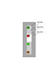
Creating the Background ImageFirst, we need to start by creating our four different image states, separated by enough space so that even if the links wrap some, we will not see the next button state poking up, as shown in Figure 2.
Here, I made the buttons a pretty good size and separated them by 100 pixels from the top of one button state to the top of the next state. This is important to remember because that means each button starts 100 pixels after the next, with a 10-pixel margin at the top so that they are a little better centered with the text of the link they will be placed next to. If you know the maximum width of a column, you can run your sprite images horizontally instead of vertically. Of course, whichever way you orient your sprites (vertically or horizontally), the extra space will add slightly to the file size, but if you save it as a GIF or PNG, the impact will be almost negligible.
One image element type that cannot be included in the sprite file is the tiled background. Obviously, if you need the image to repeat, you can’t have just a single area of the sprite image repeat.
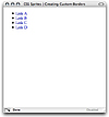
Creating the StylesNow it’s time for the code. To begin, let’s set up the links using a list:
Nothing breathtakingly remarkable here. Without CSS, this list of links will look something like Figure 3.
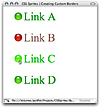
Of course, we will be providing our own bullets, so we need to redefine the
Notice that I also set the height of list elements to 90 pixels (remember that there are 100 pixels between each button state) and hide any overflow. You will need to set the height to your specific needs, but this will ensure that the other button states stay masked when not needed. If you are designing with browsers other than Internet Explorer, you can set this as max-height, so that 90 pixels are not taking up the space unless needed.
Now it’s time for the links. We start with the generic link appearance when it is within a list tag:
li a { background: white url(images/buttons.png) 0px 0px no-repeat; padding-left: 40px; }We are loading the image we saved (I called mine buttons.png and saved it in an image folder), have set its position to the top-left corner (0px 0px) meaning that the default state (link) is showing, and no repeating. We also need to set enough padding on the left side so that the text part of the link doesn’t overlap the image bullet in the background. This is, of course a matter of design. I’m using a pretty boring looking light bulb bullet for this example, but you may want to do something more exciting where the background image and text overlap and interact.
Now we need to define the background position for each state:
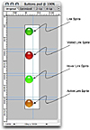
li a:link { color:#009900; background-position: 0px 0px; } li a:visited { color:#996666; background-position: 0px -100px; } li a:hover { color:#00cc00; background-position: 0px -200px; } li a:active { color:#cccc00; background-position: 0px -300px; }For each state, we just move the background image up by 100 pixels. For each state, the background image slides up and down to show the relevant image for that state.
This rollover example is just a simple example of what you can do with CSS sprites. You can create much larger images used to provide not only interactive states but also with all the graphic chrome (except for backgrounds) contained within your site.
For more information on Web design, visit our or sign up for our .
